ShopDreamUp AI ArtDreamUp
Deviation Actions


Suggested Deviants


Suggested Collections


You Might Like…


Description
▷ © Florian K., since 2013/2017
Background images:
Panel 1: Katie (alaskahokie) CC-BY, Panel 3: Cristiana Bardeanu CC-BY, Panel 4: Sadie Hart CC-BY, Panel 5: Patrik Nygren CC-BY-SA, Panel 6: Shepard5711 CC-BY-SA
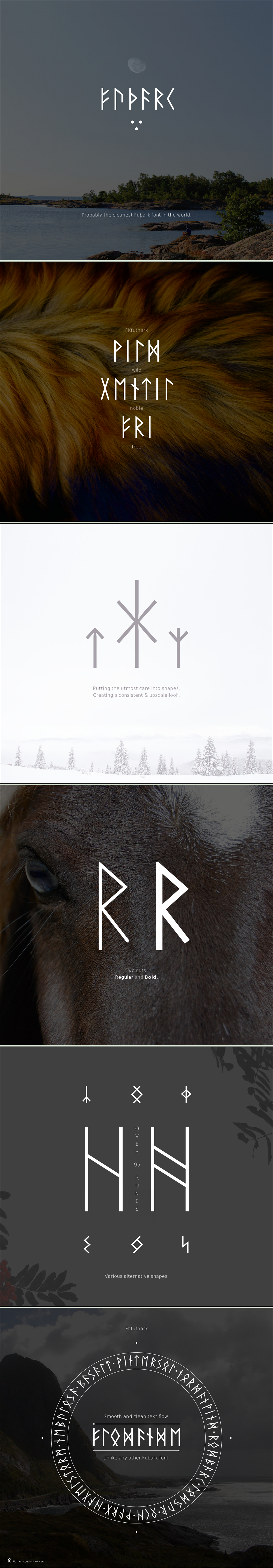
This was a font design experiment in which I created a runic font optimized for the use in long passages. All runes were given a consistent and smooth design to avoid the introduction of holes or irregularities in texts. After looking back at it I can say that the experiment was quite successful and the font creates a uniquely homogenous texture unlike any other runic fonts I've studied.
You can find some Fuþark fonts on the web, but I wasn't satisfied with their typographic quality. Most of them are very irregular, unproportional or simply without grace.
I tried to unify the runes to give them a clean, modern and very light appearance with narrow proportions. My interpretation of the Fuþark shows a more harmonic and "svelte" image and a clean text structure that is ornamental at the same time.
This version might not be historically correct, but it wasn't my intention to "reproduce" the runes — I wanted to create a modern, harmonic variation of them.
I included different shapes of every rune of the Elder Fuþark and most runes of the newer rows (95 runes in total).
The font also includes the 3 ættir in encoded form that can display numbers.
SPECIFICATIONS
• includes 100 symbols (95 runes and alternatives)
• includes runes of the Elder Fuþark + their variations
• includes runes of the Younger Fuþark + their variations
• includes the 3 numeric ættir
• Regular + Bold cut
• years of creation: 2012 to 2013
► Old font specimen
Background images:
Panel 1: Katie (alaskahokie) CC-BY, Panel 3: Cristiana Bardeanu CC-BY, Panel 4: Sadie Hart CC-BY, Panel 5: Patrik Nygren CC-BY-SA, Panel 6: Shepard5711 CC-BY-SA
This was a font design experiment in which I created a runic font optimized for the use in long passages. All runes were given a consistent and smooth design to avoid the introduction of holes or irregularities in texts. After looking back at it I can say that the experiment was quite successful and the font creates a uniquely homogenous texture unlike any other runic fonts I've studied.
You can find some Fuþark fonts on the web, but I wasn't satisfied with their typographic quality. Most of them are very irregular, unproportional or simply without grace.
I tried to unify the runes to give them a clean, modern and very light appearance with narrow proportions. My interpretation of the Fuþark shows a more harmonic and "svelte" image and a clean text structure that is ornamental at the same time.
This version might not be historically correct, but it wasn't my intention to "reproduce" the runes — I wanted to create a modern, harmonic variation of them.
I included different shapes of every rune of the Elder Fuþark and most runes of the newer rows (95 runes in total).
The font also includes the 3 ættir in encoded form that can display numbers.
SPECIFICATIONS
• includes 100 symbols (95 runes and alternatives)
• includes runes of the Elder Fuþark + their variations
• includes runes of the Younger Fuþark + their variations
• includes the 3 numeric ættir
• Regular + Bold cut
• years of creation: 2012 to 2013
► Old font specimen
Image size
1000x5737px 5.1 MB
© 2017 - 2024 Florian-K
Comments3
Join the community to add your comment. Already a deviant? Log In
Is it possible to download this as a font somewhere? Or did you stay with this representation? I like it very much, and I also think you achieved what you wanted to achieve  (Smile)") So great work!!
So great work!!